Updated October 14, 2026. Written for PhotoCraft 0.8.2 (what changed since).
Steps
- Open the photo. Go to photocraft.run/editor and drag in a JPEG, PNG, WebP, TIFF or iPhone HEIC photo, or use File › Open.
- Choose the Horizontal Type tool in the toolbar and click where the text should start. A new type layer appears in the Layers panel.
- Type your text. Select it to change the font, weight, size, tracking, leading and color in the Character panel, and the alignment in the Paragraph panel.
- Place it. Switch to the Move tool and drag the text into position. Edit › Free Transform scales and rotates it.
- Make it readable with a layer style: use Layer › Layer Style and turn on Stroke or Drop Shadow (details below).
- Export. File › Export › Export As… gives you PNG, JPEG or WebP with a size preview. Save a PSD as well if you might change the words later.
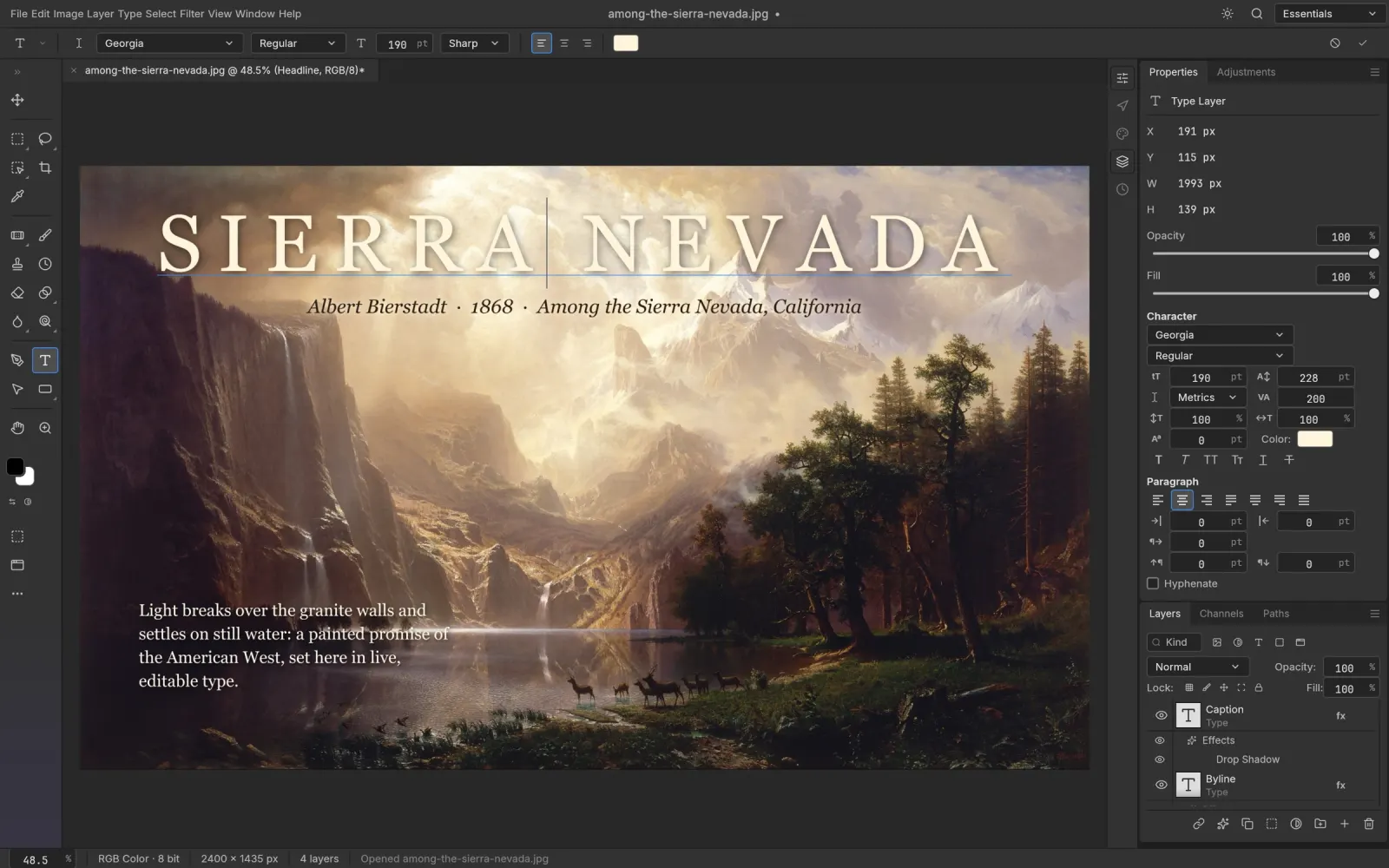
One line or a paragraph
Clicking once gives you point text: a single line that grows as you type and only breaks where you press Enter. That is right for headlines, labels and meme captions. For a caption of two or three sentences, drag out a box with the Type tool instead; paragraph text wraps inside the box. If you started with the wrong kind, the Type menu converts point text to paragraph text and back.
Make it readable on a busy photo
White text on a sky is easy. White text on a crowd, foliage or a bright street is where text gets hard to read, because part of every letter sits on something light. Layer styles fix this without touching the photo, and they stay editable on the type layer.
A stroke draws an outline around every letter. For bold, poster-style text it is the most reliable fix. We'd start with a dark stroke of about 2 to 4 pixels on a 1,080-pixel-wide image and go thicker only for chunky display fonts.
A drop shadow is the quieter option. A soft, dark shadow with a little distance separates light text from a light background without the cartoon look of a heavy outline. Outer Glow does a similar job on very busy areas because it spreads evenly in every direction.
A caption card is the third way, and the one that works on any photo: draw a rectangle with the Rectangle tool behind the text layer, fill it with black or white, and lower the layer's opacity until the photo shows through. A drop shadow on the card lifts it off the photo. The project's own demo image puts its title on a caption card with a drop shadow.
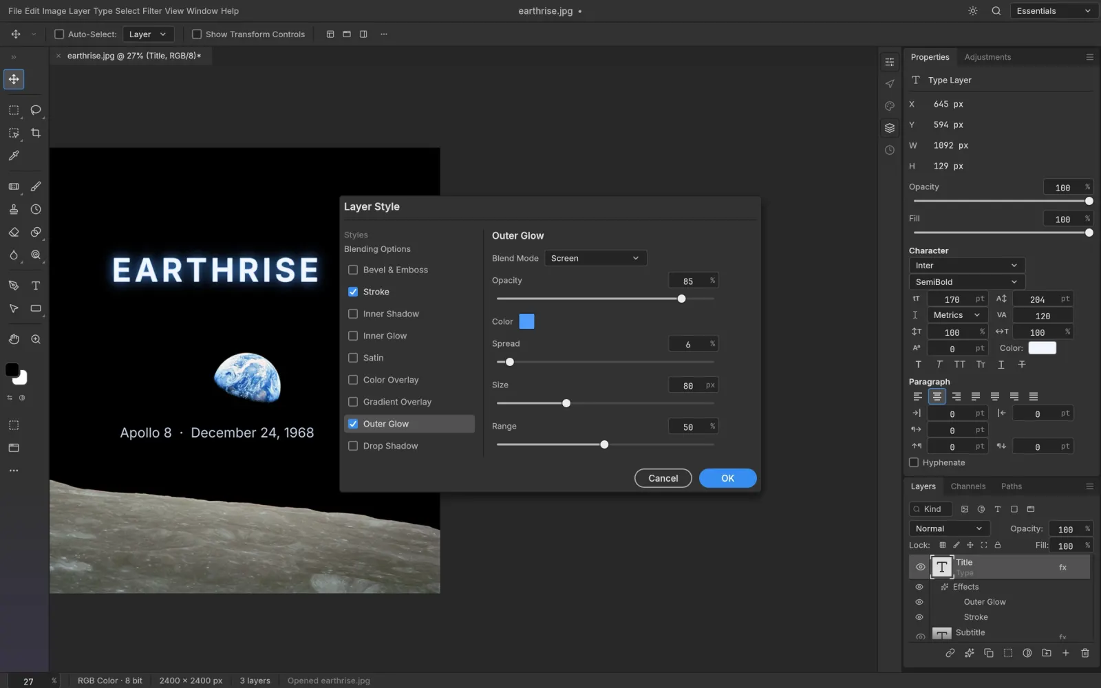
Once one text layer looks right, copy its layer style and paste it onto the others so every line matches.
Fonts you can use here
A browser can't use the fonts installed on your computer. The editor on photocraft.run offers 39 open-license families instead, downloaded the first time you pick one:
Noto Sans CJK SC · BIZ UDPGothic · BIZ UDMincho · Shippori Mincho · Noto Sans Arabic · Noto Sans Thai · Noto Sans TC · Noto Sans KR · Noto Sans SC · Noto Serif SC · Noto Sans JP · Roboto · Open Sans · Montserrat · Lato · Poppins · Inter · Raleway · Nunito · Work Sans · DM Sans · Space Grotesk · Oswald · Bebas Neue · Anton · Archivo Black · Playfair Display · Merriweather · Lora · DM Serif Display · Abril Fatface · Lobster · Pacifico · Dancing Script · Caveat · Great Vibes · Bangers · Righteous · Roboto Mono
For a loud headline, Anton, Bebas Neue, Oswald or Archivo Black. For an elegant caption, Playfair Display or Lora. For handwriting, Caveat or Dancing Script. The Noto families cover Chinese, Japanese, Korean, Arabic and Thai, so text in those scripts shows real characters instead of empty boxes. If your brand uses a font that isn't here, the desktop app can use the fonts installed on your system.
Vertical and warped text
The Vertical Type tool sets text top to bottom, for Chinese and Japanese layouts or a narrow label along the edge of a photo. Warp Text, in the Type menu, bends a type layer with bend and distortion settings, the classic arched-headline look.
Save twice
Export flattens everything: in a PNG or JPG the text is pixels and can't be edited. So before closing, use File › Save As… to download a PSD too. In the PSD the text stays a live type layer with its styles, and it opens in Photoshop as well as in PhotoCraft. Next week's version of the poster then means changing a date, not starting over.
For the shared image, PNG keeps text edges crisp and supports transparency; JPEG makes smaller files for photos. If you choose JPEG for a photo with small text, keep the quality high, since JPEG compression blurs fine letter edges first. Converting a PSD to PNG or JPG goes through the export options in more detail.
The browser version has no autosave, so save the PSD before you close or reload the tab.
Want to cut the subject out and put the text behind it? Remove the background on a copy of the photo layer, then drag the type layer between the two.